


Introduction
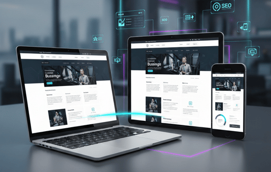
In 2026, users access websites from smartphones, tablets, laptops, and desktops more than ever before. A responsive website automatically adjusts to different screen sizes, providing a smooth experience on every device.
Businesses that ignore responsive design risk losing visitors, customers, and search engine rankings.
Better User Experience
Responsive websites make browsing easier by ensuring:
- Proper text readability
- Easy navigation
- Faster mobile usability
- Improved accessibility
A better user experience keeps visitors engaged and increases the chances of conversions.
Improves Mobile Traffic
Most internet users now browse through mobile devices. Responsive design helps websites perform properly on smartphones and tablets, allowing businesses to reach a larger audience effectively.
Helps SEO Rankings
Google prioritizes mobile-friendly websites in search results. Responsive design improves:
- Website performance
- Mobile usability
- Page speed
- Search engine visibility
This helps businesses attract more organic traffic.
Cost-Effective Solution
Instead of creating separate desktop and mobile websites, responsive design allows businesses to manage one website for all devices. This reduces maintenance costs and simplifies updates.
Builds Professional Brand Image
A responsive website creates a modern and professional impression. Customers are more likely to trust businesses that offer smooth and consistent browsing experiences across all devices.
Final Thoughts
Responsive web design is no longer optional in 2026. It improves user experience, supports SEO, increases mobile engagement, and helps businesses grow online.
At Dizi Solutions, we create responsive websites that deliver performance, usability, and modern design for businesses of all sizes.
 More Insights